TASK THREE-PRODUCTION
COVER PAGE
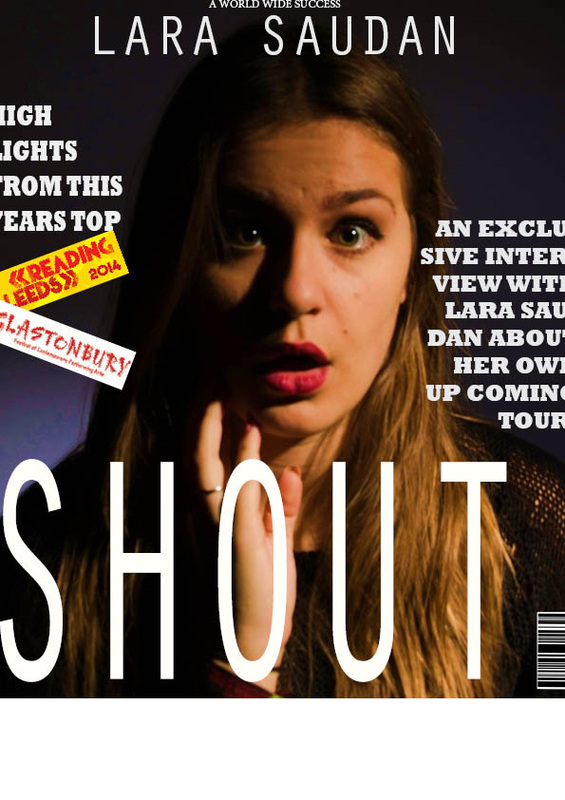
This was my orginal magazine that I completed in Indesign; howeveroverall I only like the image, as it has space at the top and around the edge for text which is good meaning I don't have to cover any of the main part of the image with text. The typo although the white font stood out from the quite dark background I don't feel it bends in and works for this cover, and all the writing is the same colour, making it quite boring, with the typo i feel the text is too chunky and in your face for the look I am trying to achieve in this cover page which is more modern and sleek. The images of the logos of the festivals are blocks and I feel it would be alot better if I used photoshop to eliminate the yellow and white background just to leave the type, because that colours contrast with the background a lot. So I think im going to redo this and improve it to make it how I want. Also after importing it into a pdf file from Indesign it cropped my image having some of the edges of text cropped off.
Alterations I am going to make to my original design.
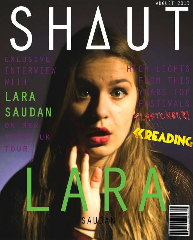
I think everything in this cover page; however I feel the purple writing against the purple background blends in alot and I want it to stand out alot more so I am going to play around with some text tools and see which tool works best.
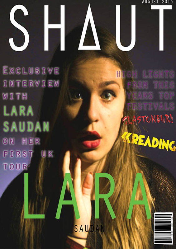
My final edit of my cover page-
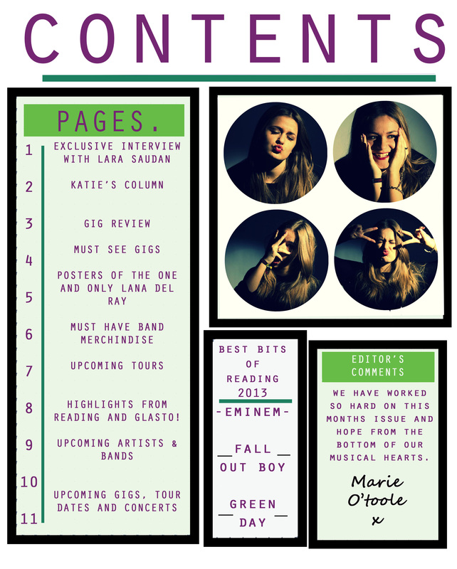
CONTENTS PAGE
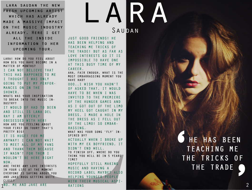
DOUBLE PAGE SPREAD
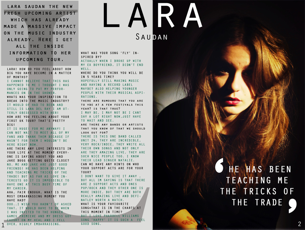
Looking at my double page spread I first didnt like the amount of writing I had on the left hand side and I feel to make it the best it could possibly be I am going to redo this in a publicating programme InDesign as i feel these aspects will help me make my work more professional looking and have a better sleek look overall. Although I am going to use indesign I have and will use photoshop to edit my photos.
My Screenshots from my Indesign Process and Photoshop
My new Double Page Spread